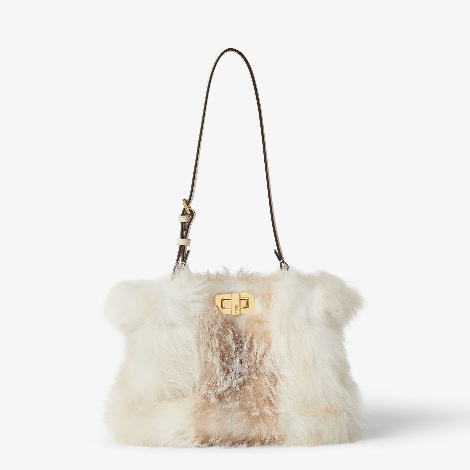
Fendi's overlooked codes
The fur room on the third floor of the Palazzo della Civiltà Italiana smells faintly of cedar and something else — lanolin, perhaps, or the particular must of pelts stored in climate control for decades. A technician in a grey smock is turning over a sable coat from 1968, checking the lining. The seams are still intact. The dye, a smoky grey that reads almost violet under certain light, has not faded. This is not the Fendi that appears on Instagram. This is the other one.
Most conversations about the house begin and end with the Baguette, or else with the double-F logo that Karl Lagerfeld sketched on a napkin in 1965. Fair enough. Both are significant. But they are also convenient — easy to photograph, easier to explain. What gets lost in that shorthand is the rest of the vocabulary: the techniques, the material obsessions, the aesthetic tics that predate the logo and will likely outlast it. Fendi has always been a house of craft first, spectacle second. It is worth looking at what happens when the spectacle steps aside.
The Fur Atelier and the Invention of Lightness
Fendi was founded in 1925 by Adele and Edoardo Fendi as a leather and fur workshop on Via del Plebiscito. The early work was straightforward — bourgeois coats, sturdy handbags, the kind of thing one expected from a Roman atelier in the interwar years. What changed the house was not ambition but technique. In 1965, a young Karl Lagerfeld was brought in to oversee the fur line. He had no particular expertise in pelts. What he had was a dislike of weight.
Lagerfeld's first move was to strip fur of its historical baggage — literally. He began treating skins the way one might treat fabric: slashing, inlaying, weaving strips of mink with leather or grosgrain. He introduced intarsio, a marquetry technique borrowed from woodworking, to create geometric patterns in broadtail and astrakhan. He perforated. He dyed sable in acid yellow and pale grey, colours no one associated with luxury fur. The result was a fur coat that weighed less than a wool one and looked, depending on the angle, like an optical experiment.
This approach — call it dematerialisation — became the house's foundational logic. Fendi has always been interested in making heavy things light, stiff things supple, precious things wearable. It is there in the way the atelier skives leather down to one millimetre for a bag lining. It is there in the selleria stitch, a saddle-maker's technique that allows a seam to flex without splitting. It is a kind of engineering that does not announce itself, which is precisely why it gets overlooked.
The Peekaboo and the Geometry of Restraint
When Silvia Venturini Fendi designed the Peekaboo in 2009, the brief was not to create a hero bag. The brief, such as it was, was to make something her mother might carry. The result is a study in geometric restraint: a structured tote with a twist-lock closure and an internal partition that allows the bag to be reversed, showing a different material or colour depending on which way it is turned. No logo on the exterior. No hardware for hardware's sake. The name itself is a joke — a reference to the way the bag's contents are glimpsed through the opening, nothing more.
What makes the Peekaboo quiet is its proportions. It is not oversized. It does not slouch. The handle is a single piece of leather, rolled and stitched at a width that distributes weight evenly across the palm. The frame is rigid enough to hold its shape when empty, which is rarer than it should be. One suspects that the bag's longevity has less to do with marketing than with the fact that it solves a functional problem — how to carry a day's worth of objects without looking like one is moving house — and solves it well.
Fendi has produced dozens of variations on the Peekaboo since its debut. Some are successful. Others feel like the design team was told to justify their salaries. But the original remains legible, which is more than can be said for most bags that achieve commercial scale.
The Runaway and the Myth of the Monogram
In 2000, Fendi introduced the Baguette. In 2019, Fendi introduced the Runaway. The former became a cultural object, the latter did not, and the reasons are worth examining. The Runaway is a structured shopper with a detachable pouch, clean lines, and almost no branding. It was designed to be versatile — office, travel, weekend — and it is. It is also, by most measures, a better bag. Better construction, better materials, better hardware. What it lacks is narrative.
The Baguette succeeded not because it was carried under the arm like a loaf of bread, though that helped, but because it arrived at a moment when logomania was still a coherent language. The double-F was legible at twenty paces. The Runaway, by contrast, is nearly anonymous. In an era when visibility equals value, anonymity is a commercial risk. Fendi took it anyway, which suggests either confidence or indifference. Possibly both.
This is the tension that runs through the house's current output. Under Kim Jones, who took over womenswear in 2020 following Lagerfeld's death, Fendi has oscillated between spectacle — the Versailles show, the collaboration with Marc Jacobs, the logo-heavy capsules — and a quieter, more material-focused approach. The latter shows up in the tailoring, in the way Jones has revived the house's archive of intarsia fur techniques, in the bags that do not beg to be photographed. It is not always legible in a lookbook. It is legible in person.
The Codes That Do Not Photograph
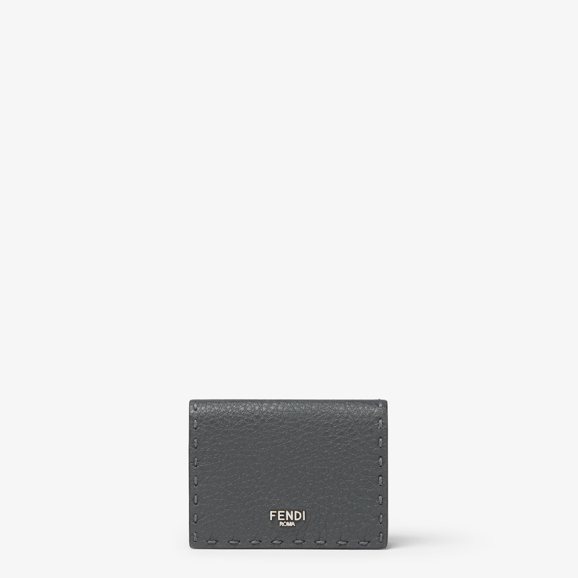
There are elements of Fendi's vocabulary that resist digital reproduction. The selleria stitch, for instance, which appears on the handles of the Peekaboo and the straps of certain belt bags, is a hand-sewn saddle stitch that uses two needles and a waxed linen thread. It is stronger than a machine stitch and, over time, develops a slight sheen from the friction of the thread against the leather. One can photograph it, but the photograph does not convey the information that matters — the tactile difference, the way the stitch allows the leather to move without puckering.
The same is true of Fendi's approach to colour. The house has a long history of working in what one might call off-tones: a brown that reads as charcoal, a grey that shifts toward lavender, a yellow that is nearly khaki. These are not colours that trend well. They are also not colours that photograph well under artificial light, which means they tend to disappear in the visual economy of fashion media. But they are the colours that look correct in Rome in November, under an overcast sky, worn with a wool coat and flat boots. They are site-specific.
This is the Fendi that does not make headlines. It is the house of the fur technician on the third floor, checking seams. It is the house of the selleria atelier, stitching handles by hand because the machine cannot replicate the tension. It is the house that dyed sable grey in 1967 and is still, five decades later, asking what happens when you treat a precious material as though it were common.
A friend who works in the Rome atelier once told me that the most difficult part of her job is not the technique — that can be taught — but the restraint. Knowing when to stop. When not to add another detail, another flourish, another logo. Fendi, at its best, has always understood this. The Baguette may have made the house famous, but it is the Peekaboo, the intarsia, the off-tone grey, the saddle stitch — the codes that do not shout — that will define it in the long run. Whether the market rewards that kind of patience is another question entirely.