Jacquemus's overlooked codes
The straw hat appeared in the spring 2017 show — not the opening look, not the finale, but somewhere in the middle stretch where a collection either coheres or drifts. It was oversized, sun-bleached, and placed at an angle that suggested the wearer had just come in from the wheat field behind the venue. No logo. No hardware. The hat did not photograph particularly well from the front row. But it sold out in three days, and by August you could spot it on every second terrace in Marseille. One suspects Simon Porte Jacquemus noticed.
What followed was not a pivot but a doubling-down on a vocabulary that had been there from the beginning, legible to anyone who cared to look past the Le Chiquito. The tiny bag — yes, functional as a talisman, absurd as a carryall — became the house's calling card, and with it came a certain shorthand: Jacquemus makes things small, sunny, and built for the algorithm. The assessment isn't wrong, but it's incomplete. Underneath the meme-ready silhouettes and the Pantone-perfect campaigns lies a remarkably consistent set of codes, quieter and more rooted in place than the headline pieces suggest.
Founding and the Provençal Line
Jacquemus launched in 2009, when Simon Porte Jacquemus was nineteen and newly arrived in Paris from the Var. The early collections were raw, occasionally clumsy, and shaped by a homesickness that never quite left the work. He named the house after his mother, Valérie Jacquemus, who had died the year before. The gesture was sentimental, but the clothes were not. They were cut close, often asymmetrical, with hems that ended mid-thigh and straps that crossed the body at unexpected angles. The palette leaned into the washed-out ivory and ochre of southern France in high summer, colours that don't register as "fashion" in the way a saturated red or cobalt does.
By 2013, the silhouette had sharpened. Jacquemus began working with a single recurring shape: the off-shoulder top, sometimes structured, sometimes draped, almost always finished with a single tie or knot at the shoulder. It appeared in linen, in cotton poplin, in a stiff canvas that held its form like a sail. The shape became a house signature, though it never received the same attention as the accessories that would follow. One can trace a line from those early tops to the current ready-to-wear, where asymmetry remains the default and balance is always slightly off-centre.
The other early code, less visible but more enduring, was the use of negative space. Jacquemus cuts away fabric where other designers add it — under the arm, at the hip, across the back. The effect is not minimalism, exactly. It's closer to architectural restraint, the kind that makes a courtyard feel larger by leaving the centre empty. He applies the same principle to his runways, which are often set in open fields or on salt flats, the models walking a single line through a landscape that dwarfs them. The clothes don't compete with the setting. They rely on it.
The Bag Era and What Came With It
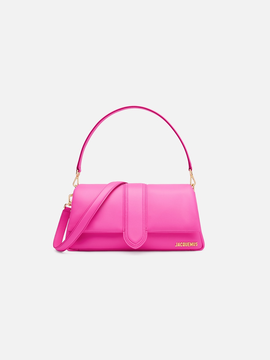
Le Chiquito launched in 2018, and the trajectory changed. The bag measured 5 centimetres across, retailed for €200, and became the most-discussed accessory of the year. It was followed by Le Petit Chiquito, even smaller, and then by a series of larger, more practical styles that borrowed the same curved silhouette and top handle. The Chiquito family now includes a dozen variations, from the nano to the overnight, all of them recognisable by the same soft trapezoidal shape and the discreet logo stamped into the leather at the base of the handle.
What the bag did, beyond generating revenue, was establish a formal language that Jacquemus has since applied across categories. The curve of the Chiquito's body reappears in the house's sunglasses, in the heel of its mules, in the arc of a straw tote. It's a shape that reads as organic, almost biomorphic, and it stands in deliberate contrast to the hard-edged geometry that dominated accessories in the prior decade. One notes that Jacquemus rarely uses a straight line when a gentle curve will do.
The bag era also brought the colour work into sharper focus. Jacquemus has always worked with a narrow palette, but starting around 2019 he began isolating single shades for entire collections — not as accents but as total environments. Spring 2020 was built around a specific yellow, somewhere between mustard and marigold, that appeared in every look and every accessory. The following season leaned into a pale lavender that looked almost grey in certain light. The approach is less about trend forecasting and more about establishing a mood, a chromatic consistency that makes the work immediately identifiable even when the logo is absent.
Current Direction and the Expansion
Jacquemus now operates at a scale that would have been unimaginable a decade ago. The house produces multiple collections a year, maintains standalone boutiques in Paris and several other cities, and has entered categories — menswear, homeware, beauty — that typically come much later in a brand's lifecycle. The expansion has been swift, but the aesthetic has remained remarkably stable. A linen shirt from the current men's line carries the same off-centre placket and oversized sleeve as the womenswear from 2015. The new homeware collection, launched last year, includes ceramic plates in that same sun-bleached ivory and serving bowls with the same curved profile as the Chiquito.
What has shifted, subtly, is the level of finish. The early collections had a certain roughness to them, hems that frayed intentionally, seams that sat slightly askew. The current work is more polished, the construction cleaner, though Jacquemus still resists anything too precious. A recent dress, cut from heavyweight linen and dyed a flat terracotta, had raw edges at the neckline and sleeves — not as a design flourish but as a practical choice, the kind a dressmaker in Aix might make to save time. The effect is studied casualness, which is harder to achieve than it looks.
The runway presentations have also evolved, though they remain tied to the landscape. The spring 2024 show took place in a lavender field outside Valensole, the models walking through rows of purple in dresses that picked up the same colour. It was picturesque, yes, but also specific — Valensole is in the Alpes-de-Haute-Provence, an hour from where Jacquemus grew up. The location wasn't chosen for its photogenic qualities alone. It was a return, geographically and aesthetically, to the codes that shaped the house from the beginning.
The Overlooked Signatures
If one were to list the defining elements of Jacquemus beyond the logo and the hero bag, the inventory would include: asymmetry as a structural principle, not a detail. Negative space used to create volume. A palette drawn from the Provençal landscape, applied in blocks rather than gradients. Curves instead of angles. Linen and cotton poplin over silk and satin. Proportions that feel slightly off — sleeves too long, hemlines too short, waistbands that sit several inches above or below the natural waist. And, perhaps most consistently, a refusal to over-finish. The clothes look easy, which means they're not.
There's also the matter of the button. Jacquemus uses a particular style of covered button, wrapped in the same fabric as the garment, that appears across nearly every collection. It's a small detail, the kind that doesn't register in a runway image but becomes obvious when you handle the piece. The buttons are slightly oversized, often placed asymmetrically, and they give even the simplest shirt a sense of deliberate construction. One notices them, eventually.
The same applies to the house's approach to branding. The logo exists — a simple wordmark, usually placed at the hem or on a leather tag — but it's never the point. Jacquemus doesn't rely on monogramming or repeated motifs. The clothes are identifiable by their shape, their colour, their proportions. It's a quieter form of recognition, the kind that requires familiarity rather than instant legibility.
Where the House Stands
Jacquemus is now fifteen years old, which in fashion terms makes it neither young nor established. The house has moved past the emerging-designer phase but hasn't settled into the institutional rhythm of the heritage maisons. It exists in a middle space, expanding rapidly but still closely tied to a single creative vision. Whether that model is sustainable long-term remains to be seen. For now, the work continues to feel personal, even as the scale grows.
The quieter codes — the asymmetry, the negative space, the off-centre buttons — remain intact. They're easy to miss if you're looking for the obvious signifiers, the logo bag or the campaign shot. But they're there, consistent across fifteen years of collections, and they're what give the house its coherence. One can buy the tiny bag, or one can buy the linen dress with the raw hem and the sleeve that's three inches too long. Both are Jacquemus. Only one requires you to already know what you're looking at.
There's a photograph from the spring 2023 show, taken just after the finale, that captures something essential about the house. The models are walking back through the set — a simple dirt road in the Camargue, lined with wild grasses — and one of them has stopped to adjust her sandal. She's wearing a pale yellow dress, cut on the bias, with one shoulder bare. The dress has no logo, no hardware, no obvious markers. But the shape is unmistakable: slightly off-balance, open to the air, built for a specific kind of light. She fixes the strap and keeps walking.