The back pocket on an Acne Studios jean sits slightly higher than you expect
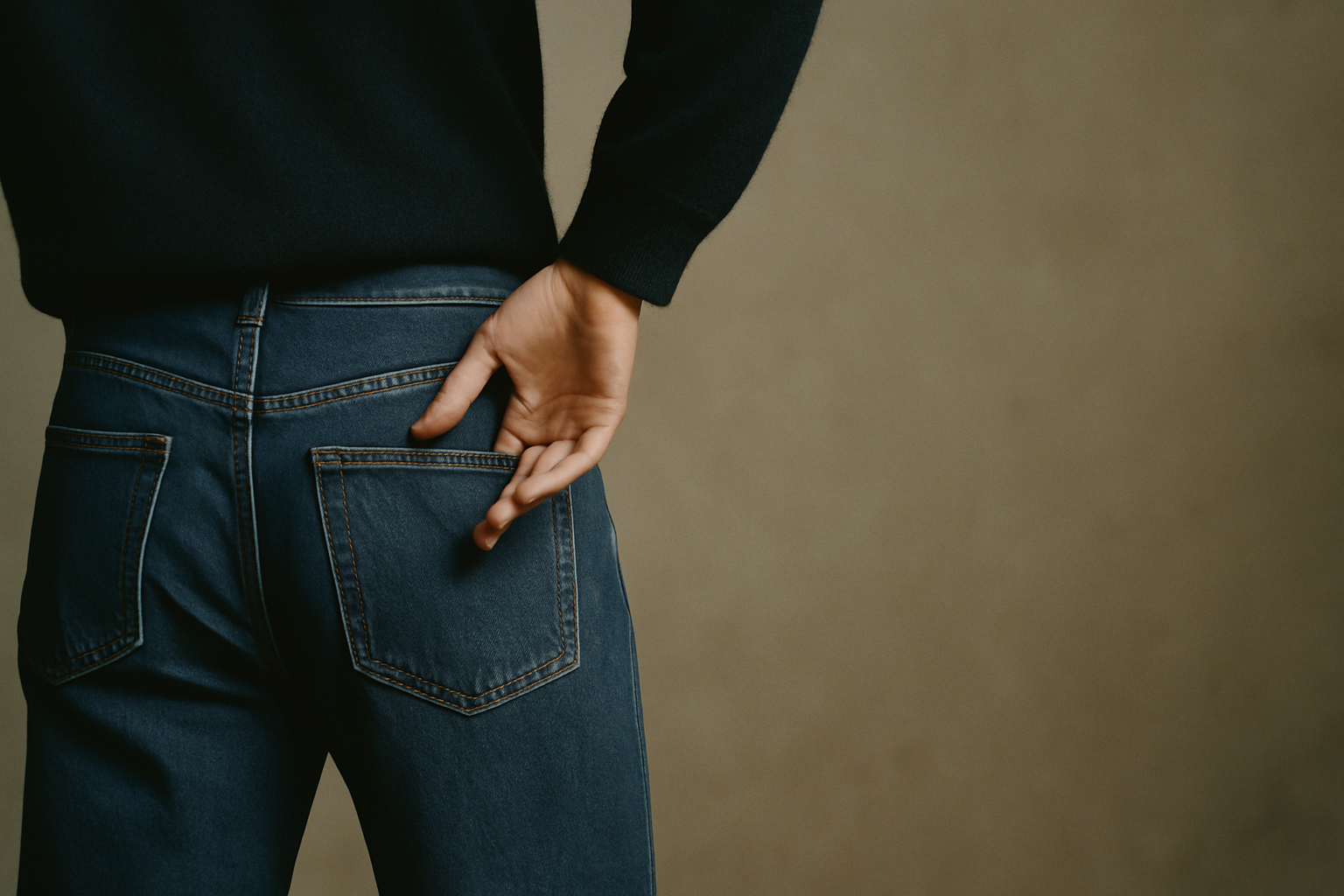
The back pocket on an Acne Studios jean sits slightly higher than you expect. Not enough to notice in the mirror, but your hand finds it in the wrong place the first time you reach. That small miscalculation is intentional. Jonny Johansson has said he wanted the jeans to feel foreign, even to the person wearing them.
This is the kind of detail that does not photograph well. It does not make it into campaign imagery or mood boards. But it is more central to Acne Studios than the face logo, more defining than any single bag. The house builds its vocabulary in these minor displacements — things that read as almost right, which makes them feel entirely new.
The founding, and what it was not
Acne Studios began in 1996 as Acne Jeans, a creative collective in Stockholm that made furniture, magazines, and eventually denim. The first jeans were raw, unisex, and given away to friends. One hundred pairs in a single cut. The project was not meant to be a fashion house. It became one because the jeans moved through the city in a way that was visible.
Johansson, one of the four founders, stayed with the project when the others left. He had no formal training in pattern-making. He approached garments the way a graphic designer approaches a page: structure first, decoration later, and only if it clarifies the structure. The early collections were built from this logic. Straight seams. Flat pockets. Fabrics chosen for weight rather than hand. The clothes looked spare because they were spare.
By the mid-2000s, Acne Studios had become known for denim that fit like suiting and suiting that moved like jersey. The silhouette was narrow but not tight, and the palette stayed within a range that could be called greyscale if grey were not so limiting a term. Johansson worked in shades that had no common names: a blue that looked grey in certain light, a grey that read as pink at dusk. The house did not explain this. It simply produced collections in which colour was treated as a structural element, the way a tailor treats a dart.
What the house does with a shoulder
The Acne Studios shoulder is not built for emphasis. It does not extend past the natural line. It does not pad or sculpt. What it does is drop — slightly, just enough to shift the weight of a jacket or coat forward. The effect is a silhouette that looks unfinished, as though the garment is still being worn in.
This is deliberate. Johansson has spoken about wanting clothes that do not announce themselves, that require a second look to understand. The dropped shoulder accomplishes this. It makes a blazer read as casual without turning it into a shirt-jacket. It makes an overcoat feel like something you borrowed, even when it was cut for you.
The construction is simple. The sleeve is set lower, the armscye is wider, and the shoulder seam falls an inch or two past the bone. But the result is a garment that moves differently. The fabric has room to shift. The body underneath is less fixed. You can see this in the way the house styles its lookbook images: models stand still, but the clothes appear to be in motion.
This approach extends to other garments. The Acne Studios trouser has a higher rise than most contemporary cuts, but the waistband is left unfinished on the inside. The sweater has a boxy body but narrow sleeves. The scarf — which has become one of the house's most recognizable pieces — is wider and shorter than a traditional scarf, so it sits on the chest rather than hanging from the neck. Each piece is slightly off in a way that makes the whole outfit cohere.
The scarf, which is not a logo play
The oversized wool scarf with the Acne Studios label stitched to one end has been in production since 2010. It is the house's most visible signature, and also the most misunderstood. The label is not there for branding. It is there because Johansson wanted the scarf to feel like a sample, something pulled from a studio before it was finished.
The scarf is wide enough to function as a blanket. The fringe is long and uneven. The wool is not fine — it is a coarse, almost felt-like material that holds its shape even when draped loosely. The label, which is pink or black or sometimes green, is the only element that reads as decorative. But even that is understated. The text is small. The stitching is visible. The label sits at the end of the scarf, where it falls against the body rather than facing outward.
What makes the scarf work is its proportions. It is large enough to disrupt the line of a coat, but not so large that it overwhelms the wearer. It adds volume without adding complexity. And because it is a single piece of fabric with minimal construction, it photographs as a block of colour. This is useful in an era when most fashion images are consumed at thumbnail size.
The scarf also demonstrates the house's approach to repetition. Acne Studios does not release the scarf in dozens of colours each season. It releases three or four, and those colours remain in production for years. This is not a capsule strategy. It is a refusal to treat the scarf as a trend. The house wants the piece to be available, not scarce. It wants you to see it on the street often enough that it stops registering as a statement.
Where the house is now
Johansson is still the creative director. This is worth noting because Acne Studios has been majority-owned by a private equity firm since 2015, and most houses in similar positions have cycled through creative leadership at least once. The consistency shows in the collections. The palette has expanded slightly — more browns, more off-whites — but the silhouette remains narrow and the construction remains minimal.
The house has introduced bags, shoes, and small leather goods, but these categories feel secondary. The Musubi bag, which launched in 2018, uses a knotted strap as its primary detail. The knot is structural, not decorative. It holds the bag closed. This is the same logic that governs the scarves, the dropped shoulders, the higher pocket placement. Every detail is load-bearing.
What Acne Studios has not done is retreat into archival references or expand into lifestyle branding. The house does not reissue old collections. It does not collaborate with artists or musicians in a way that reshapes the product. It simply continues to make clothes that look like Acne Studios clothes, which is to say clothes that feel slightly wrong until you have worn them long enough to understand why they are cut that way.
The jean, still
The back pocket still sits too high. The denim is still raw when it leaves the factory. The fit is still narrow through the leg but loose at the waist, which means the jeans require a belt even when they fit. None of this has changed in twenty-eight years.
Johansson has said he does not think about legacy. He thinks about the next collection, and the collection after that. But legacy accumulates anyway. It accumulates in the small decisions that become house codes, in the details that do not announce themselves but that shape the way a garment is worn. The high pocket is one of those details. You reach for it, your hand lands in the wrong place, and you adjust. That adjustment is the work.