The jeans had a red thread running through the inseam
The jeans had a red thread running through the inseam. Not a logo. Not embroidery. Just a single red line you'd only see if you rolled the cuff or happened to sit cross-legged in good light. Acne Studios launched with a hundred pairs in 1996, all given to friends in Stockholm, and that thread was the only mark. It stayed through the first five years of commercial production, then disappeared sometime around 2003. Most people who bought the jeans never noticed it. That was the point.
Acne Studios built a vocabulary that worked best when you weren't trying to read it. The house codes aren't absent—they're just operating a few inches to the left of where most brands plant their flags. No monogram canvas. No signature hardware that shows up in airport duty-free. What Acne developed instead was a set of recurring gestures so consistent they became a dialect, and so quiet that the brand itself has occasionally seemed to forget them.
Jonny Johansson and the founding refusal
Johansson started Acne as a creative collective in 1996 with three partners, all working in graphic design and advertising in Stockholm. The name—Ambition to Create Novel Expressions—landed somewhere between art-school posture and actual manifesto. The jeans were a side project, cut from Italian denim and sewn in a small atelier outside the city. They fit slim through the thigh, sat low, broke cleanly at the ankle. In Sweden at the time, denim still meant Levi's 501s or stonewashed bootcuts left over from the decade prior. Acne's jeans didn't look revolutionary. They looked correct.
The collective sold them from a studio on Torsgatan. No retail strategy, no lookbook. By 1998, a few Stockholm boutiques wanted stock. Johansson started designing shirts and outerwear to fill orders, then knitwear, then a women's line. He hired pattern-cutters who had worked in theatrical costume and tailors trained in the city's old menswear houses, people who knew how to construct a sleeve that moved. Acne became a fashion brand by accident, or at least by increments.
What Johansson didn't do: put the name on the outside. The earliest Acne pieces carried small interior labels, sometimes just a size tag with 'Acne Jeans' printed in Helvetica. The refusal wasn't ideological—it was aesthetic. Johansson thought logos looked cheap. He also thought most branding looked like it was trying to convince you of something. Acne's first code, then, was the decision not to code at all.
The vocabulary that built itself
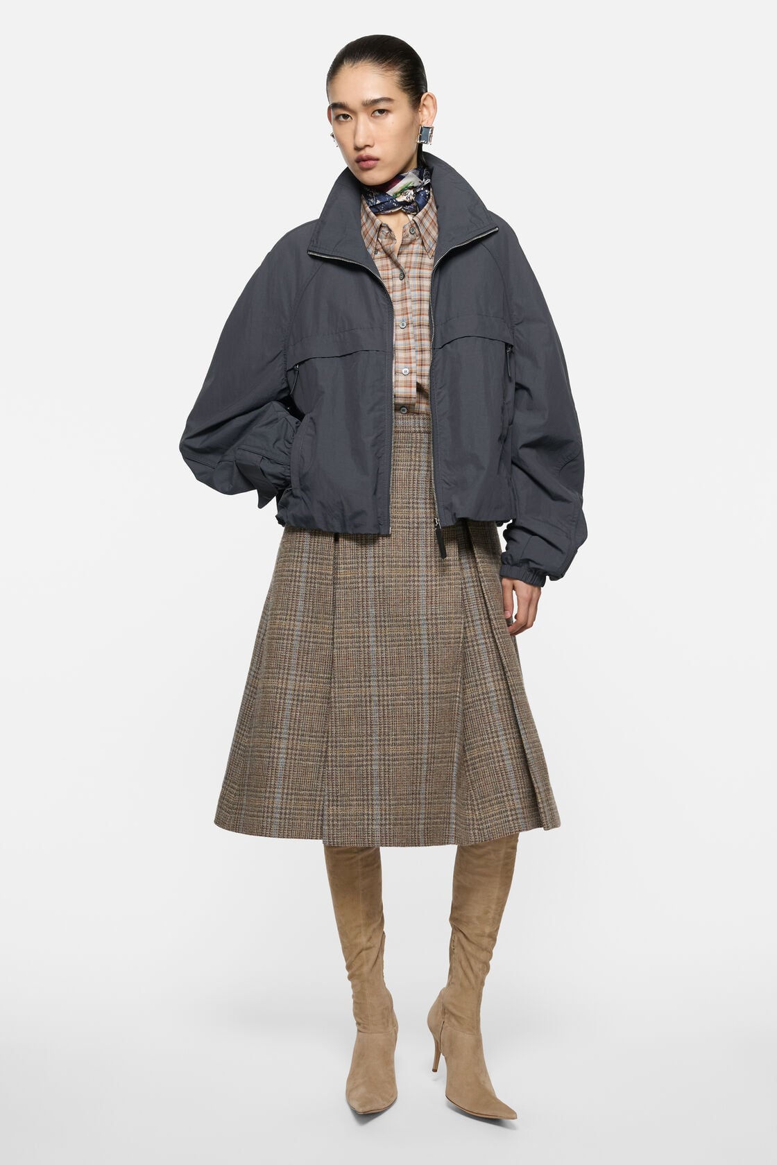
By the mid-2000s, Acne had developed a set of recurring shapes that started to feel like a house style, even if Johansson kept insisting he was just making clothes he wanted to wear. The leather jacket with a slightly dropped shoulder and a boxy, cropped body. The oversized scarf in felted wool that hung past the knee. The narrow trouser with a clean front and no visible pocket. The crew-neck sweater in a brushed wool so soft it looked like it had been worn for years.
None of these were revolutionary cuts. What made them Acne was the proportions—always a half-size off from what you expected—and the materials. Johansson sourced heavily from Italian and Japanese mills, often ordering custom weights or asking for fabrics to be pre-washed in ways that simulated age. He wanted clothes that looked like they had a past. Not distressed. Not vintage. Just broken in.
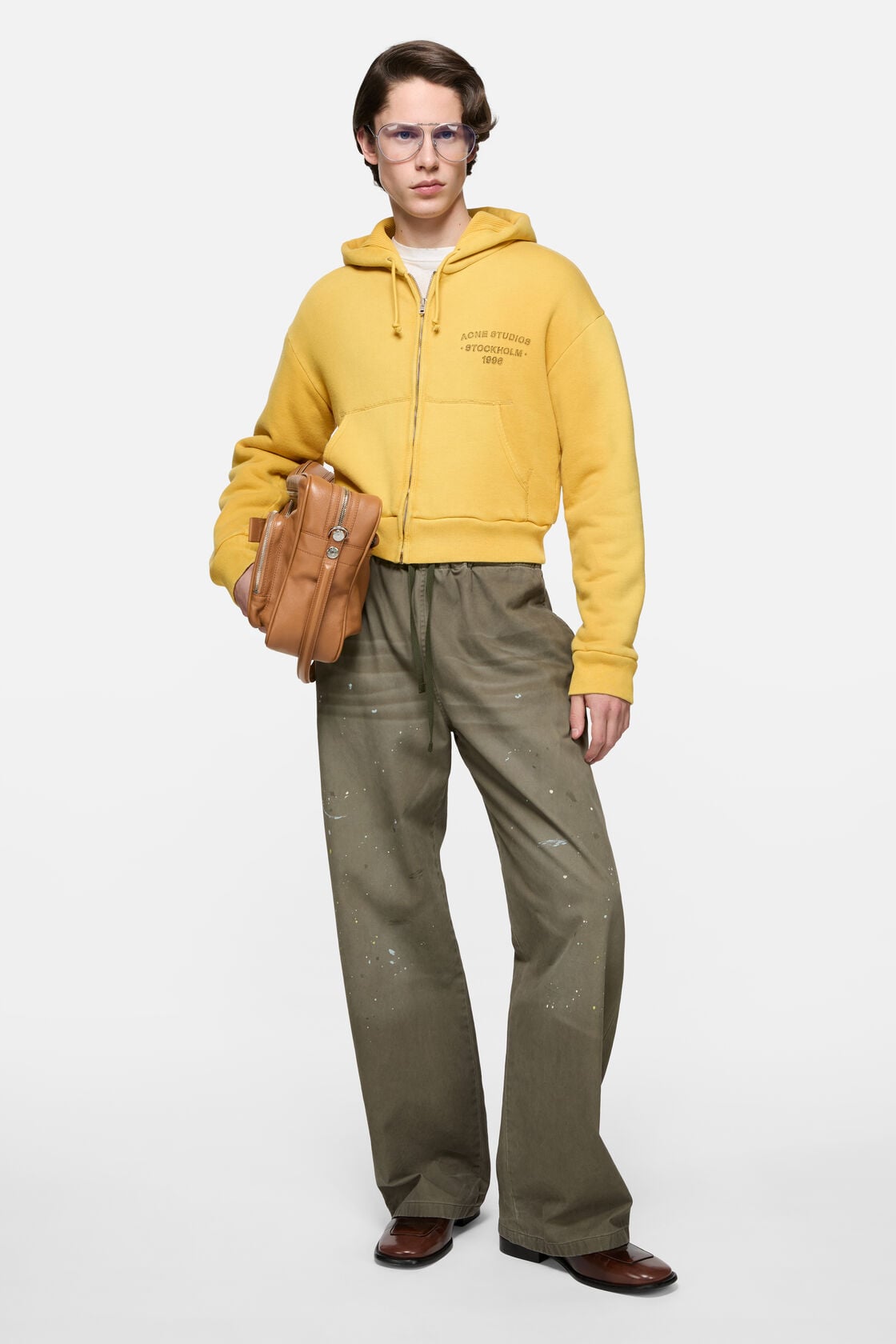
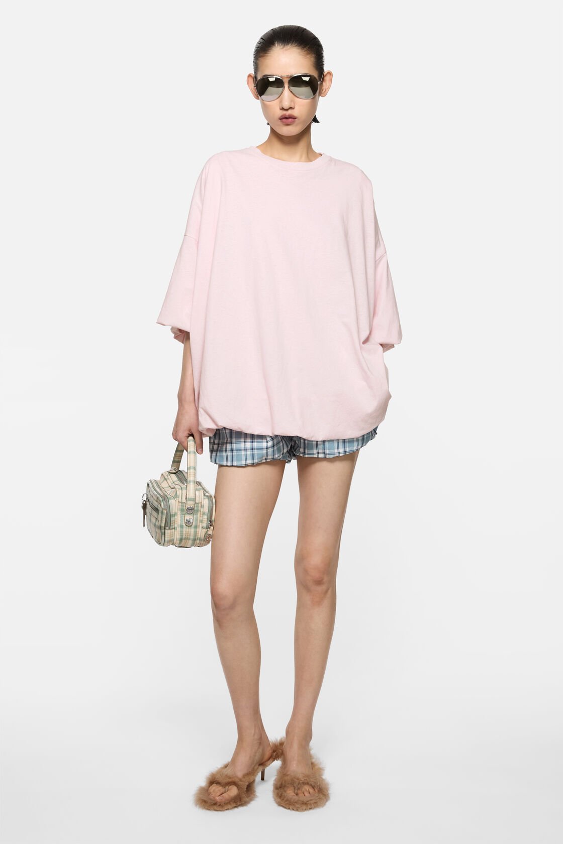
The other signature: colour that refused to perform. Acne's palette in those years ran to grey, camel, rust, a particular shade of pale pink that looked like it had been left in the sun. When the house used black, it was often a washed-down black that read closer to charcoal. When it used white, the white had weight—a cream undertone, a texture that kept it from looking sterile. The brand did occasionally deploy a bright—electric blue, acid yellow—but always in a way that felt like a disruption, not a theme.
The scarves became the closest thing Acne had to a signature product. Oversized, fringed, sold in a narrow range of solid colours. They showed up in every campaign and on every editor who covered the brand. But they weren't logo'd. They weren't hardware-heavy. They just looked like the thing you'd want if you understood what Acne was doing. Which meant they also looked like something you could buy anywhere, if you didn't.
Johansson's long game
Johansson stayed on as creative director through the house's expansion into Asia, its investment deals, its flagship openings in New York and Paris. He's still there now. That kind of tenure is rare enough in the industry that it's worth noting—most founders either sell and leave or sell and stay on for a contracted three-year creative transition before the house brings in someone younger. Johansson sold a majority stake to a private equity firm in 2006, then watched that stake get sold again in 2015. He kept designing.
What's shifted isn't the codes—it's the volume around them. Acne Studios now operates over fifty stores. The collections are larger, the seasonal drops more frequent, the collaborations more visible. The house introduced a logo treatment in the early 2010s—a simple wordmark, often placed on the back of a sweatshirt or the side of a sneaker. It's restrained by contemporary standards, but it's there. The brand needed a way to signal itself in a market that had become exponentially noisier.
The risk, of course, is that the signal becomes the thing. Acne's newer customers often come in looking for the logo sweats or the logo tote, pieces that function as legible entry points. The house still makes the oversized wool coat with the slightly dropped shoulder, the narrow trouser in the pre-washed black, the leather jacket that looks like it's already yours. But those pieces now share floor space with product that's designed to move faster and read louder. Johansson has said in interviews that he's fine with this. He's also said that he still thinks the best Acne piece is the one you can't immediately identify.
What's left when you look closer
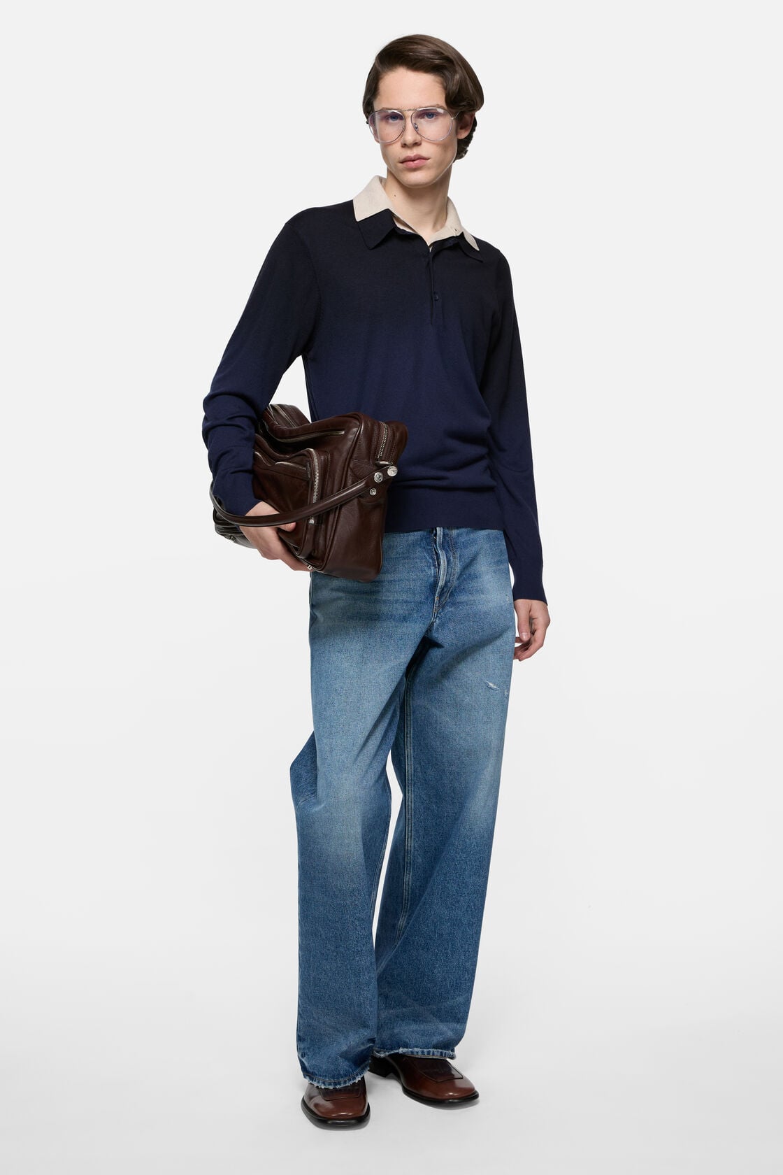
The codes that remain are the ones that never needed announcing. The house still cuts its sleeves long, so they break at the wrist and bunch slightly when you push them up. It still uses flat seams on its knitwear, a construction detail that makes the garment lie smoother against the body but costs more to produce. It still pre-washes most of its cotton and linen, so the fabric has give from the first wear. The denim still sits low and breaks clean, though the red thread is long gone.
Acne's leather is worth singling out. The house works primarily with Italian tanneries and favours a matte, slightly pebbled finish that doesn't shine under retail lighting. The leather jackets aren't stiff when new—they're supple, almost soft, constructed in a way that lets them mold to your frame within a few wears. This isn't something you notice in the store. It's something you notice six months in, when the jacket starts to feel like it was cut for you specifically.
The house also still does something unusual with its colour transitions. Instead of offering a piece in black, grey, and camel as separate SKUs, Acne will occasionally produce a single garment that shifts between tones—a sweater that's grey at the shoulder and fades to rust at the hem, or a coat in a wool that reads differently depending on the light. It's a small move, and not every season includes it, but it's one of those gestures that reminds you someone's still thinking past the product grid.
There's a coat from the A/W 2019 collection, a long wool overcoat in a colour the house called 'camel melange.' It had no logo, no visible branding, no hardware except the buttons. The wool was Italian, the lining was silk, the shoulder dropped just slightly so the whole thing hung like it weighed nothing. It looked like a coat you could have bought in 1998 or 2018 or ten years from now. That's the code. Not timeless—Acne's never been interested in that kind of claim—but resistant to the moment. A coat that works because it refuses to try.