The pink label — not the one you see, the interior one — is still there
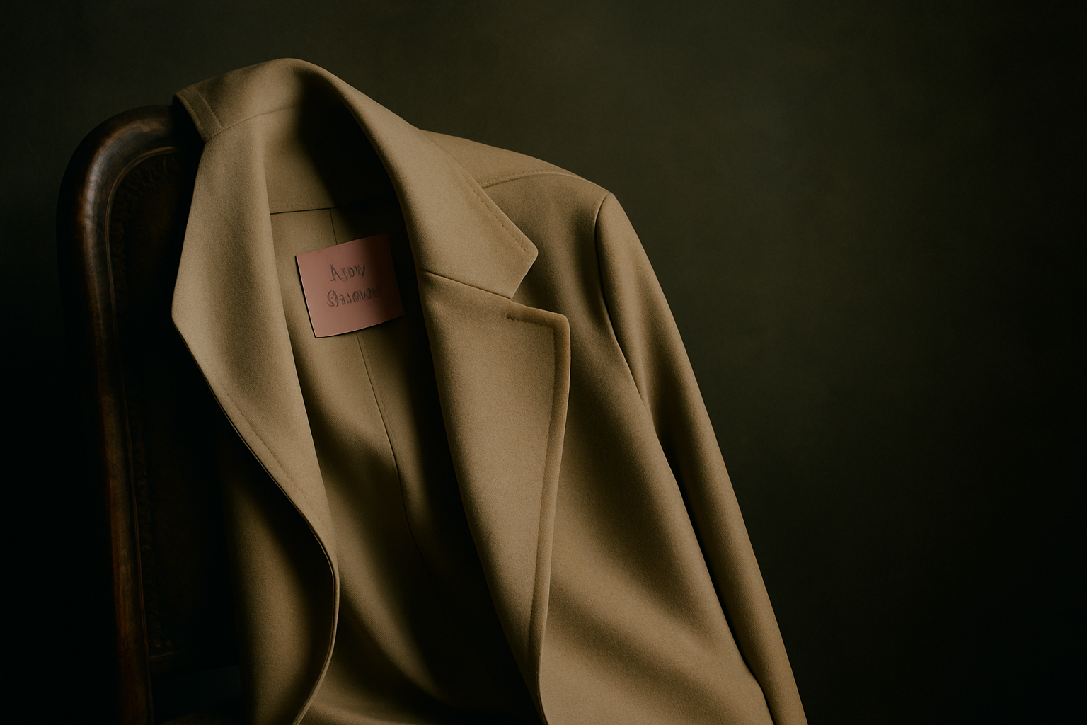
The pink label — not the one you see, the interior one — is still there. It is sewn into the inside seam of every Acne Studios garment, a small rectangle of fuchsia with the house name in black capitals. Most people never notice it. The label faces inward, against the body. It was Jonny Johansson's idea in the late nineties, a private signature before the brand had public ones.
That impulse — the gesture that does not announce itself — defined Acne Studios for longer than the tote bag has. The house built its reputation on refusals. Refusal of obvious branding. Refusal of a single silhouette. Refusal, most of all, of the idea that Scandinavian design had to mean pale linen and right angles. What Johansson and his original collective offered instead was a kind of wry pragmatism: clothes that worked in Stockholm winter, that moved through art openings and band rehearsals, that treated denim as a starting point rather than a destination.
The founding mythology is well-worn by now. A creative collective called ACNE — Ambition to Create Novel Expressions — starts making jeans in 1996. The jeans have red stitching. They fit in an unfamiliar way, higher and straighter through the leg. Johansson, a photographer and art director, begins designing other pieces to go with them. By 2000, the collective has become a fashion house. The name stays.
What is less often discussed is how quickly Acne Studios developed a vocabulary that had nothing to do with denim. The Raw jeans became famous, yes, but the house language was already forming elsewhere: in the proportions of a grey wool coat, in the way a shirtsleeve was cut wider at the bicep, in the use of a single oversized patch pocket placed slightly off-centre. These were not statements. They were adjustments, small calibrations that changed how a garment sat on the body without calling attention to the change itself.
The Johansson codes
Johansson's design approach has always leaned toward the particular over the general. He does not work in archetypes. A trench coat at Acne Studios is not 'a trench' — it is a trench with the belt removed and the back vent extended six centimetres, or it is a trench cut from boiled wool instead of gabardine, or it is a trench that stops at mid-thigh instead of knee-length. The result is a garment that registers as familiar until you try to name what has shifted.
This method produces signatures that do not photograph well. They live in wearing. The house's knitwear, for instance, has maintained the same structural detail since the early 2000s: sleeves set slightly forward, armholes cut higher and smaller than standard, ribbing that stops before the cuff. On a hanger, the sweater looks unremarkable. On a body, it changes posture. The shoulder sits differently. The sleeve does not pull when you reach forward.
The face motif — the smiling logo that now appears on sweatshirts and accessories — arrived later, in 2017, and it represents a different kind of code. It is overt, almost aggressively so, a departure from the house's earlier restraint. But even that logo has a predecessor: Johansson had been using faces in his design work since the mid-2000s, printing them on T-shirts and the interior linings of jackets. The difference is visibility. What was once private became public, and that shift tells you something about the decade that followed.
What remains
The house still operates from Stockholm. That matters less for aesthetics than for process. Johansson has never worked on the traditional fashion calendar. Collections arrive when they are finished, not when the schedule demands. Runway shows happen in Paris, but the atelier work — the draping, the pattern adjustments, the fabric testing — takes place in Sweden. This creates a certain distance from the churn of trend cycles, though it does not insulate the house from them.
Acne Studios expanded significantly after 2015, when the house sold a majority stake to a private equity firm. New categories arrived: eyewear, footwear, a full accessories line. The retail footprint grew. The face logo became more prominent. Some of the earlier codes receded, not because they were abandoned but because they became harder to see amid the larger commercial apparatus.
But certain gestures persist. The house still uses that particular shade of grey — not quite charcoal, not quite dove, something in between that reads differently depending on the fabric. The tailoring still favours a longer jacket body and a narrower lapel than is currently standard. The denim, when you find it, still has the red stitching, though it is no longer the first thing the house wants you to notice.
The most consistent code is the one that is hardest to name: a willingness to make clothes that do not cohere into a single aesthetic. A collection might include a sculptural leather jacket, a pair of straight-leg jeans, a floral print dress, and a technical anorak, and the house will not attempt to unify them under a theme. They exist as individual proposals. That refusal of a totalising vision is itself a signature, though it is the kind that only becomes visible over time.
The current question
Johansson remains creative director. That continuity is unusual in an industry that treats designer turnover as a form of content. But continuity does not mean stasis, and the question facing Acne Studios now is not whether it has changed but whether the changes have clarified or diffused what the house means.
The face logo is the most visible answer. It gives the brand a symbol, a shorthand, a way to be recognised at a distance. It also risks reducing the house to that single image, flattening two decades of design work into a graphic. The tension is not unique to Acne Studios, but it is particularly acute for a house that built its reputation on the codes that did not announce themselves.
Walk into an Acne Studios store now and you will find the face sweatshirts near the entrance. Walk further in and you will find the grey coat, the adjusted shirtsleeve, the knitwear with the forward-set sleeve. Both things are true. The house contains them both. Whether one overtakes the other depends less on Johansson's design than on what we choose to see, and what we choose to forget.
The pink label is still there, inside the seam, facing inward. You have to look for it. Most people do not look.