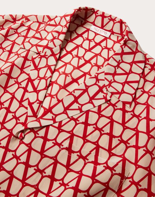
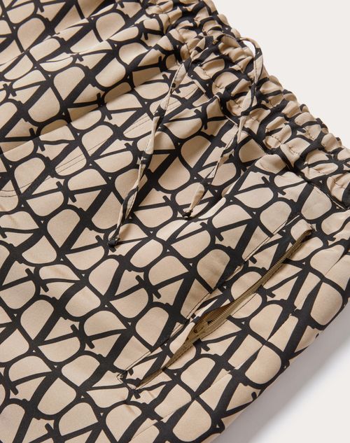
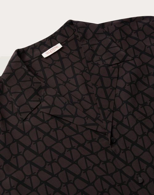
The red is not a logo
The red is not a logo. It is Pantone 18-1662 TPX, registered in 1960, and it appears less often than you think. Valentino Garavani chose it for an evening coat shown in his first couture collection, and the colour became synonymous with the house not through repetition but through restraint. When the red appears now — on a gown, on the lining of a coat — it arrives with the weight of that original gesture. But red is not the only code. It is simply the loudest.
There are quieter signatures. The bow at the back of a neckline, placed low enough to rest against the first vertebra. The use of ivory rather than white, which photographs warmer and wears kinder against most skin. The proportion of a sleeve: set slightly back from the natural shoulder line, creating a subtle forward tilt that opens the collarbone. These are not trends. They are decisions made in the Via Condotti atelier in the nineteen-sixties, and they remain legible in the work today if you know where to look.
Founding grammar
Valentino opened his maison in 1959, after apprenticeships in Paris under Jean Dessès and Guy Laroche. He returned to Rome with an understanding of French construction and an Italian instinct for ease. The combination produced a house style that was neither: gowns built with couture rigour but worn without ceremony. Elizabeth Taylor ordered from him before he was famous. Jacqueline Kennedy wore Valentino to her wedding to Aristotle Onassis in 1968, a choice that bypassed American houses entirely and signalled something about discretion, about not needing to announce.
The bow became a house signature during this period, but not in the way most people remember it. It was never decorative. Valentino used it structurally, as a way to anchor fabric at the back of a garment and create tension across the shoulder blades. The bow sits where a closure would otherwise interrupt the line, turning function into ornament without excess. You see it on cocktail dresses from 1965, on coats from 1972, on gowns from last season. It has not changed shape.
The other signature from this era is the treatment of lace. Valentino did not use lace as overlay or appliqué. He used it as the primary fabric, engineering it to hold structure without a separate lining. This required working with lacemakers in Burano and Calais who could produce yardage dense enough to bear weight. The result was gowns that moved like jersey but read as formal, a combination that became central to the house's evening vocabulary. When Maria Grazia Chiuri revived this technique during her tenure as co-creative director, she was not innovating. She was returning to an archival method that had been set aside.
The Giammetti effect
Giancarlo Giammetti, Valentino's business partner and companion for fifty years, does not design. But his influence on the house's visual codes is absolute. He controlled the staging of the collections, the layout of the salons, the angles at which garments were photographed. He understood that Valentino's work required a specific kind of presentation: no music, no theatrics, models walking at half the speed of a Paris runway. The clothes needed time to register.
This approach shaped the house's relationship to ornament. Valentino used embroidery, beading, and passementerie extensively, but never more than one technique per garment. A dress might carry thirty hours of tambour beading or clusters of silk flowers constructed by hand, but it would not carry both. Giammetti enforced this rule in the atelier, and it became a house standard. The restraint is what makes a Valentino gown legible from across a room: one gesture, fully committed.
The same logic applied to colour. Valentino worked in a narrow palette — red, ivory, black, occasionally a specific shade of pale pink or deep green — and he did not mix them within a single collection. A season might be built around ivory and gold, or black and red, but not all four. This created a visual coherence that most houses abandoned in the nineteen-nineties, when maximalism became the prevailing language. Valentino did not follow. The palette stayed narrow.
Piccioli's extraction
When Pierpaolo Piccioli became sole creative director in 2016, after Maria Grazia Chiuri's departure for Dior, he inherited a house with an established grammar and a client base that expected continuity. His first collections honoured that: ivory gowns with structural bows, lace engineered to stand alone, the occasional flash of Valentino red. But by 2019, Piccioli had begun to extract the house codes from their original context and test them under different conditions.
He introduced colour in a way Valentino never had — not as accent but as field. Gowns in fuchsia, cobalt, acid yellow, shown together in a single collection. The construction remained rigorous, but the palette exploded. He kept the bow, but moved it to the front of the garment, or eliminated it entirely on pieces where it had been standard. He worked with the same lacemakers in Burano, but he used the lace in panels rather than as full yardage, combining it with technical fabrics that Valentino would not have touched.
This was not a rejection of the house's history. It was a test of how much could be altered before the through-line disappeared. The answer, so far, is that the construction holds even when the surface changes. A Piccioli gown from 2023 does not look like a Valentino gown from 1968, but it is built using the same shoulder slope, the same approach to weight distribution, the same understanding that a dress should move independently of the body inside it.
What remains
The bow is still there, though you have to look for it now. It appears on perhaps one piece per collection, placed low on the back of a coat or at the nape of a gown. The lace work continues, though it shares space with organza and duchess satin and fabrics that have no historical precedent in the archive. The red appears, but not as often as the press assumes. Piccioli has said in interviews that he uses Valentino red only when he has something specific to say with it, which means some collections include no red at all.
What has not changed is the question the house asks of each garment: can this be worn without announcement? Valentino built his reputation on clients who did not need their clothes to speak for them, and that logic persists. The gowns are engineered for movement, for sitting, for being photographed from unflattering angles and still holding their line. The embroidery is dense enough to read from a distance but never so heavy that it restricts the body. The palette, even when it expands into colours Valentino himself never used, remains considered. One gesture per garment. No stacking.
The house is not what it was in 1968, and it is not trying to be. But the codes are still there, written into the way a sleeve is set, the way a bow is placed, the way red arrives only when it has earned the room. You learn to see them the same way you learn to see selvedge or hand-stitching: by looking at enough garments that the pattern becomes legible. Valentino is not in the logo. It is in the five millimetres of ease at the shoulder, in the ivory that is never quite white, in the fact that the red, when it finally appears, does not need to explain itself.