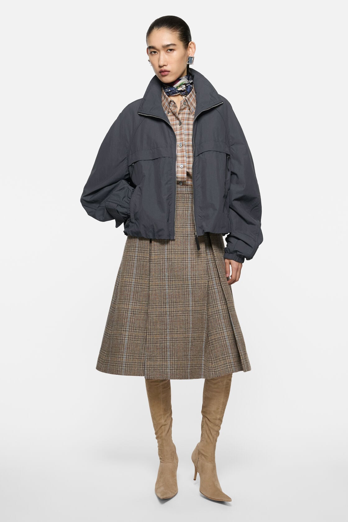
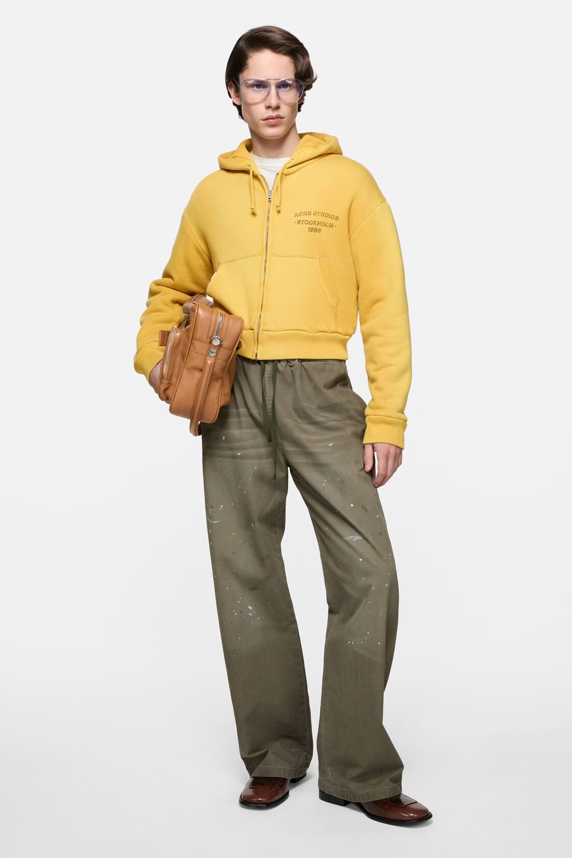
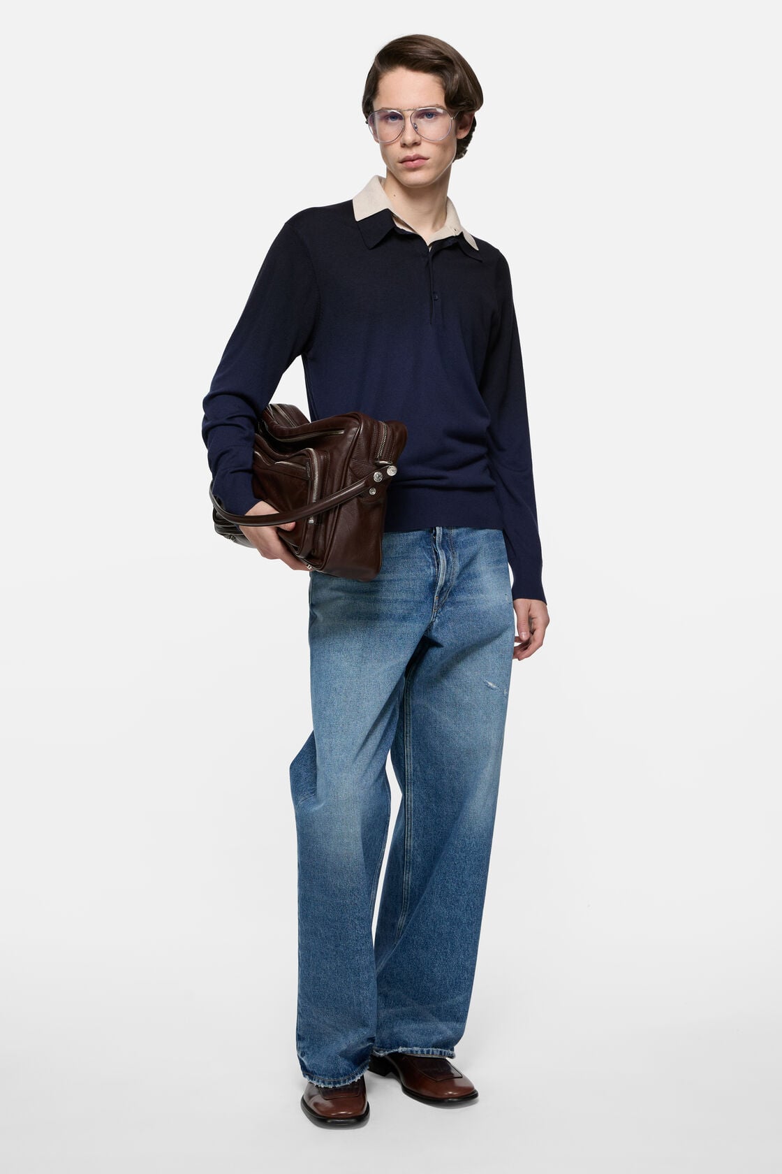
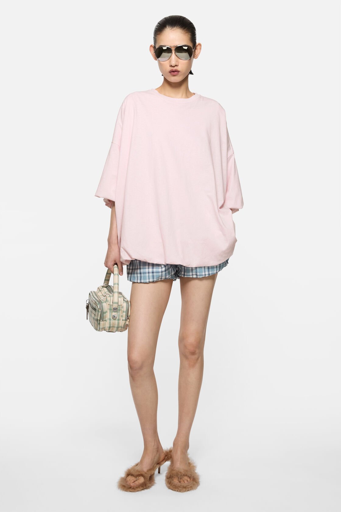
The velvet ribbon came sewn into the back neck of every Acne Studios piece for years
The velvet ribbon came sewn into the back neck of every Acne Studios piece for years. Grosgrain width, deep charcoal, sometimes burgundy. You'd catch it when you hung the garment or turned the collar down. It said Acne Studios in sans-serif capitals, nothing more. Then it disappeared. Not announced, not mourned. Just gone, sometime around 2019, when most people had stopped checking the inside of their clothes anyway.
That ribbon is a decent place to start if you're trying to locate what Acne Studios actually was before it became the brand people now associate with a face-logo tote and puddle jeans. The house built its reputation on gestures so interior they required you to already be wearing the thing. A seam that landed two centimetres lower than expected. A sleeve placket left raw. Proportions that looked wrong on the hanger and correct on the body. The work wasn't loud. It was structural, and it required a second glance.
Jonny Johansson founded the label in Stockholm in 1996, though the clothes didn't start landing in earnest until the early 2000s. The name — an acronym that stood for Ambition to Create Novel Expressions, though no one has ever needed to know that — came with a wink already baked in. The first product was a run of raw denim, 100 pairs given to friends and collaborators. The jeans had a red stitch down the back seam. Not branding, exactly. A mark. Enough to make you look twice if you knew.
What followed was a decade and a half of clothing that operated in a register between Scandinavian restraint and something more slippery. Acne Studios wasn't minimal in the Jil Sander sense. It used colour — often badly, which was part of the point. Ochre that looked like it had oxidised. Rose that read as medical. The tailoring was soft but not unstructured. Johansson worked in drape and volume before those became shorthand for 'considered design'. A blazer might have shoulders that sloped past the natural line, sleeves that broke at the wrist bone instead of above it. The effect was destabilising in a way that only registered once you tried to dress it up or down. It refused both.
The signatures no one named
The house developed a vocabulary that never quite turned into a logo system. The Jensen boot — a Chelsea with an exaggerated heel counter and a sole that was just slightly too chunned — became a silent passport in certain circles. If you saw someone wearing them with cropped trousers and an oversized knit, you didn't need to confirm the label. The boot did the work.
Same with the scarves. Acne Studios made oversized wool scarves in colours that looked like they'd been chosen by someone who had just repainted a kitchen and regretted it. They were huge, impractical, and they became the thing you wore when you wanted to signal fluency without wearing a logo. The fringe was always uneven. That mattered.
The denim operation remained central long after jenim stopped being a compelling category for most European houses. Acne Studios cut jeans with a low rise and a straight leg that looked dated until it didn't. The Roc style — raw, stiff, with a coin pocket that sat too high — aged into your body instead of distressing on command. The brand understood that denim is one of the few categories where underdesign beats overdesign, where you want the cloth to do more than the cut.
And then there was the knitwear. Johansson worked with wool that had weight but no bulk. The Nalon face-embroidered sweater became a meme, but the house made dozens of knits that never had a name or a hashtag. Cardigans with asymmetric closures. Crewnecks with sleeves that belled slightly at the cuff. Textures that looked handmade even when they weren't. The stitching was visible, sometimes deliberately loose. It was the opposite of Italian finish — it wanted you to see the labour, but it didn't want to be precious about it.
What shifted
Acne Studios went through the same expansion most mid-tier European independents faced in the 2010s. More doors, more categories, more SKUs. The house added eyewear, footwear, leather goods. It opened flagships in cities where flagships cost what a small atelier's annual budget used to. In 2014, a private equity firm took a minority stake. The creative direction didn't lurch, but it did smooth.
Johansson stayed on as creative director — still is — but the output began to split. On one end, you had runway pieces that felt like continuations of the early language. Coats with sleeves that started at the elbow. Trousers with an extra pleat that made no geometric sense. On the other end, you had product. The Musubi bag, launched around 2018, was an attempt to build a signature accessory in a market that had decided every house needed one. It sold. It also looked like a dozen other knot-closure bags that had come before it, and the house seemed to know that.
The face-logo tote — the Oilcloth Tote Bag with the flat Acne Studios wordmark — became the thing people recognised. It was cheap enough to be entry-level, logo-forward enough to register on Instagram, and durable in a way that made it feel like a reasonable purchase. It also had almost nothing to do with the brand's original codes. The tote was a product of necessity, not vision. It worked because it had to.
Where the house sits now
Acne Studios still makes some of the most interesting outerwear in the accessible-luxury bracket. The shearling work, in particular, hasn't been matched by houses twice its size. But the brand now operates in two registers that don't quite reconcile. There's the Acne Studios that shows up on runway reports — cerebral, a little odd, still committed to a kind of Scandinavian unease. And there's the Acne Studios that most people encounter in-store: logo tees, straight-leg jeans, the Musubi in five seasonal colourways.
The velvet ribbon is gone, but so is the context that made it legible. The house used to reward close looking. Now it rewards familiarity. You can still find the odd blazer with a sleeve that doesn't behave, the occasional knit with a seam that lands where it shouldn't. But those pieces sit alongside product that could have come from anywhere. The codes are still there. They've just been outnumbered.
What remains is Johansson's willingness to let a garment look wrong until it doesn't. A coat from the FW23 collection — double-breasted, but with the closure set four centimetres off-centre — is the kind of thing the house has always done well. It's not a statement piece. It's a piece that makes you restate how you thought a coat should close. That's a different kind of work, and it's harder to sell.
The brand still knows how to make a sleeve land two centimetres past where you expect it. It still cuts trousers that look like they're from another decade until you put them on. It still does colour in a way that refuses to be tasteful. But it's doing all of that inside a system that now requires it to also make a logo tote and a face-embroidered sweatshirt and a small leather good that can move units in Shanghai.
If you want to find the original Acne Studios, you can. You just have to look past the first three tables.